COLORS TO PROMOTE WELLNESS
25.06.2020

During this turbulent and tough time, so many of us have found a new reality for working, socialising and parenting, all without leaving our homes. Getting to grips with a new daily routine, social distancing from loved ones and a lot of extra time on our hands can sometimes make us feel overwhelmed and anxious, but it is key to remember you are not alone and we will all get through this together.
Colour is something which impacts us all and often we take it for granted. Colour has the power to directly impact human behaviour, whether that be to activate or calm us down. We wanted to delve further into colour psychology by introducing five colours that can help influence our mental wellbeing, whether that comes from dressing, visualising or surrounding ourselves in the soothing, soft tones explored below.

SOOTHING LAVENDER
With the capacity to bring balance and make you feel inner peace, this colour asks us to connect our bodies and our minds, and bring them to the fore. Purple hues are known to signify strength, peace and wisdom. Studies even suggest that the power of meditation is up to 10-times greater when practiced under purple lights.
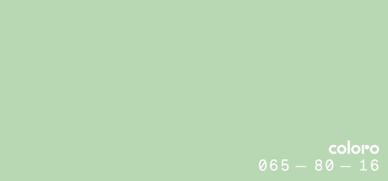
PISTACHIO GREEN
Green is a restful and nurturing tone. We associate it directly with nature and the lush outdoors, and being in nature is proven to improve mood, cognition and health.
Symbolizing health and prosperity, the Egyptians believed it was a sacred colour, representing hope, joy, spring and fertility. The creamier, softer shades are best to soothe and calm.

LAVENDER GREY
You might be a little surprised to see grey on this list since it is often linked with low moods and cloudy skies, however, the right shade of grey can be very calming and relaxing. Lavender Grey has a subtle hint of lilac to it, uplifting the shade and bringing a sense of balance. As grey is a cool, neutral and balanced colour, it creates both a solid and stable grounding – perfect to evoke a sense of calm and composure, and relief from a chaotic world.

POWDERED PINK
Pink promotes tranquillity and peace. In fact, Feng Shui believes it is the perfect tone for soothing energy, filling the heart with love. When choosing the right shade of pink, think soft and light, as brighter shades could leave you feeling overstimulated. Pinks can stir feelings of compassion, nurture and love, especially in the softer, lighter variations which are linked to tenderness and empathy.

SKY BLUE
This colour stands true to its name: peaceful, calm and gentle. Blue tones have the tremendous power of managing your stress and offering an escapism, especially in these softer, neutral shades. It was no surprise that Coloro’s recent #stayhomewithcoloro campaign on Instagram saw many people picking the summer sky as one of their top five colours that spark joy. Blue can calm your mind, slow your heart rate and lower your blood pressure, in turn reducing anxiety.
Category: #color, #design, #wellness
© 2022 Copyright GUROLERKAL


